Calvin Ip
Exploring Different Destinations with Vueling
Vueling, a Spanish low budget airline, needed a way to encourage users to buy tickets with the exploration feature.
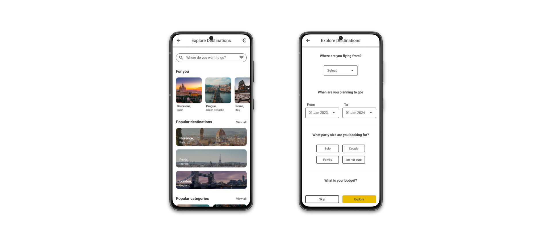
The following case study is based on a fictional scenario given during the WYK Digital UX course.
- Role: UX Researcher (team of 4), Sole UX/UI Designer
- Industry: Airline
- Project Length: 1 Week
- Platform: iOS/Android
- Tools: Jira, Figma, FigJam
The Problem
Vueling have recently released a new destination exploration feature on their website with new customers, but web statistics show that users are not making purchases after being on the page. Vueling wants to understand:
- What people think that the destination exploration feature is for.
- Any pain points for users of this section on mobile devices.
- What changes can they make to encourage people to buy tickets after visiting the page.
Solutions
- Conduct usability tests to discover the motivations behind user ticket purchases.
- Write up a short report on the findings and present them to stakeholders.
- Deliver a redesign which encourages more people to buy tickets.
Phase 1 - Stakeholder Meeting
Before we discover the motivations behind making purchases, it is important to find more information about why the stakeholders want any changes to be made. From the stakeholder meeting we found that:
- The destination exploration feature is a feature with a low conversion rate, the stakeholders want more people using the feature.
- There is a 90% drop off rate with the destination exploration feature.
- When users reach the feature, there is a high bounce rate, with lots of drop offs after clicking the feature.
- The stakeholders want us to understand why people are getting to the first page and stopping, and why they are not buying tickets with them.
- Their current competitors are other low budget airlines with European locations, such as RyanAir and EasyJet.
Phase 2 - Research and Understanding Users
Usability Testing
Due to time and the scope of the project, three remote, moderated usability tests were conducted to investigate the users motivations.
Usability Testing Insights
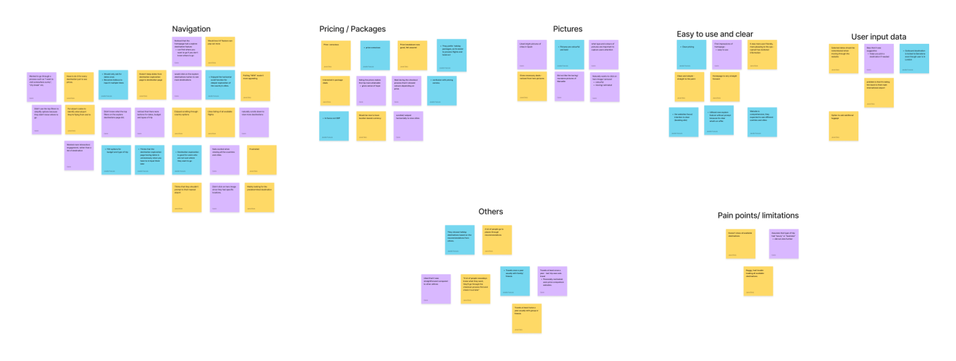
After conducting the tests, we synthesised the data by affinity mapping to find the main themes, these were:
- Navigation
- Pricing
- Easy to use and clear
- Retaining user input data
Key Findings
From the affinity map, there were three main key findings:
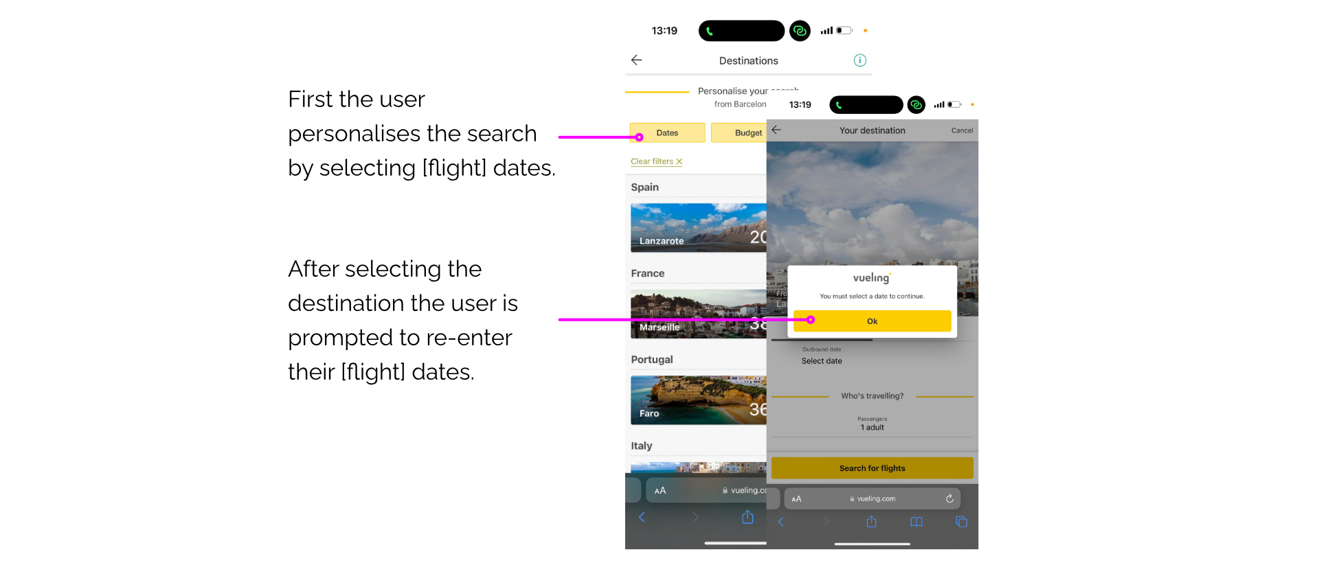
1. Frustration over date selection
Pain points
The user has to input the dates multiple times throughout the search process.
Improvements
- By removing either of the date filters the user would need less clicks, making the process more seamless.
- The selected dates should be retained when moving through the website.
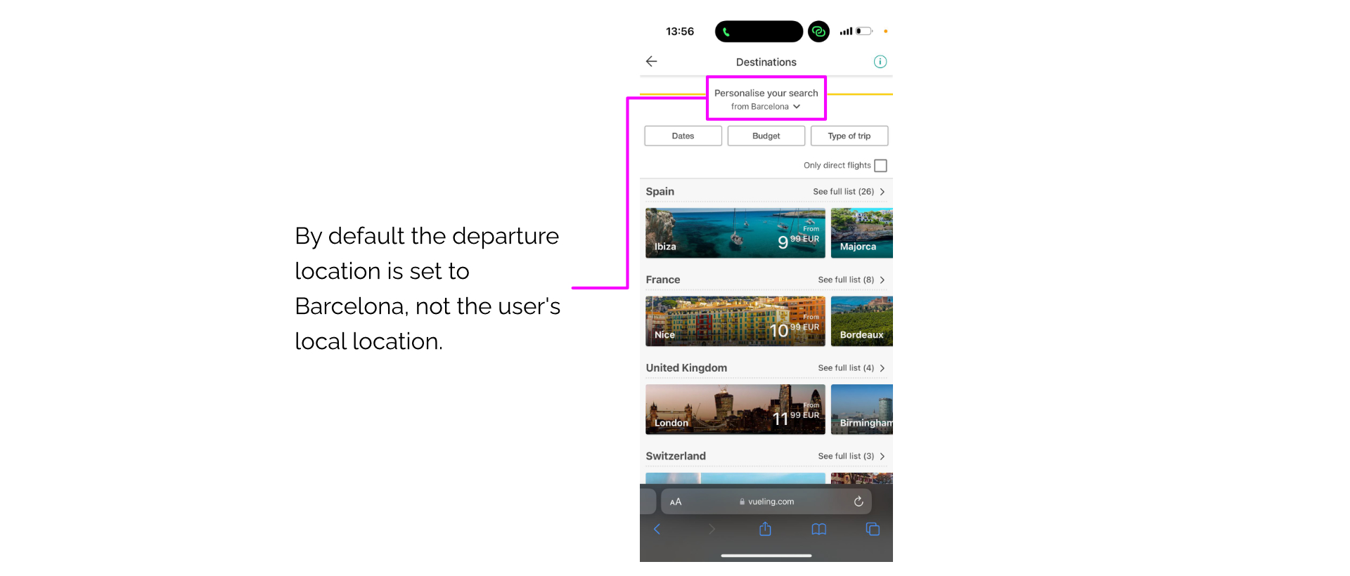
2. Selecting departure location
Pain points
Some users proceeded without using this function, when proceeding with the booking process the information was incorrect, resulting in them returning to the explore page.
Improvements
- The personalisation section on the page should be more visible to the user.
- The user could be directed to make personalisations before continuing from the explore page.
- The website can set the default departure location based on the IP address of the user.
- The user should have the ability to change the departure location during the booking process.
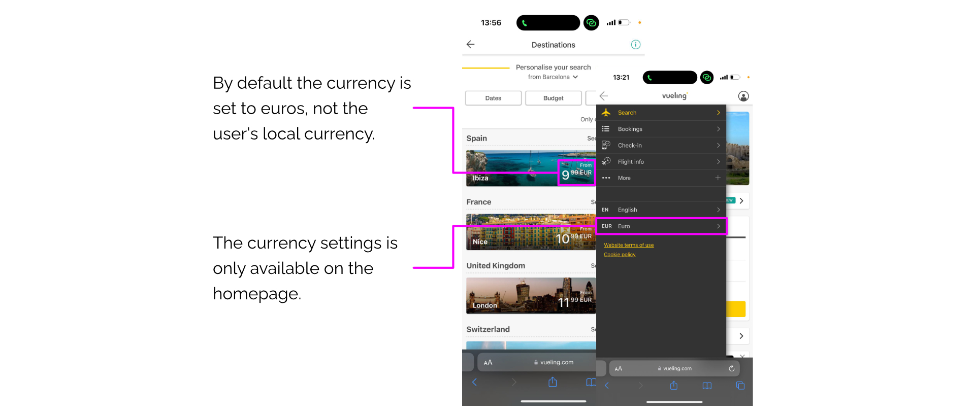
3. Default Currency
Pain points
The currency by default is set to euros, the currency converter is only located on the homepage, forcing users to go back in the process.
Improvements
- The user should have access to the currency converter on the destination exploration page.
- Give the user a currency conversion feature at the price breakdown stage of the booking process.
Phase 3 - Wireframing and Prototyping
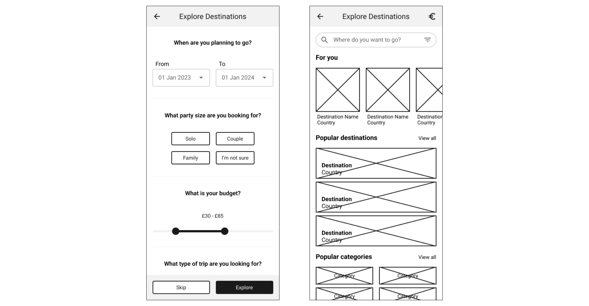
Wireframes
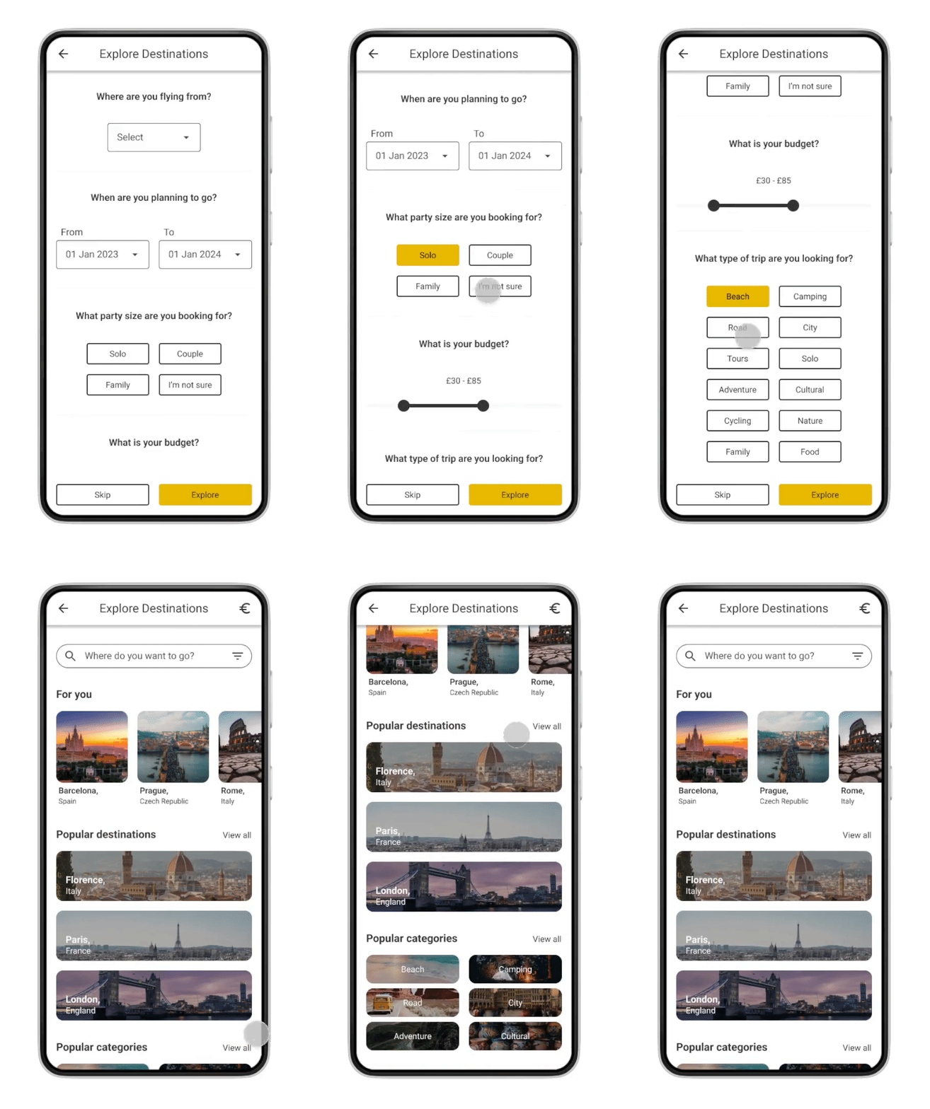
High-fidelity Mockups
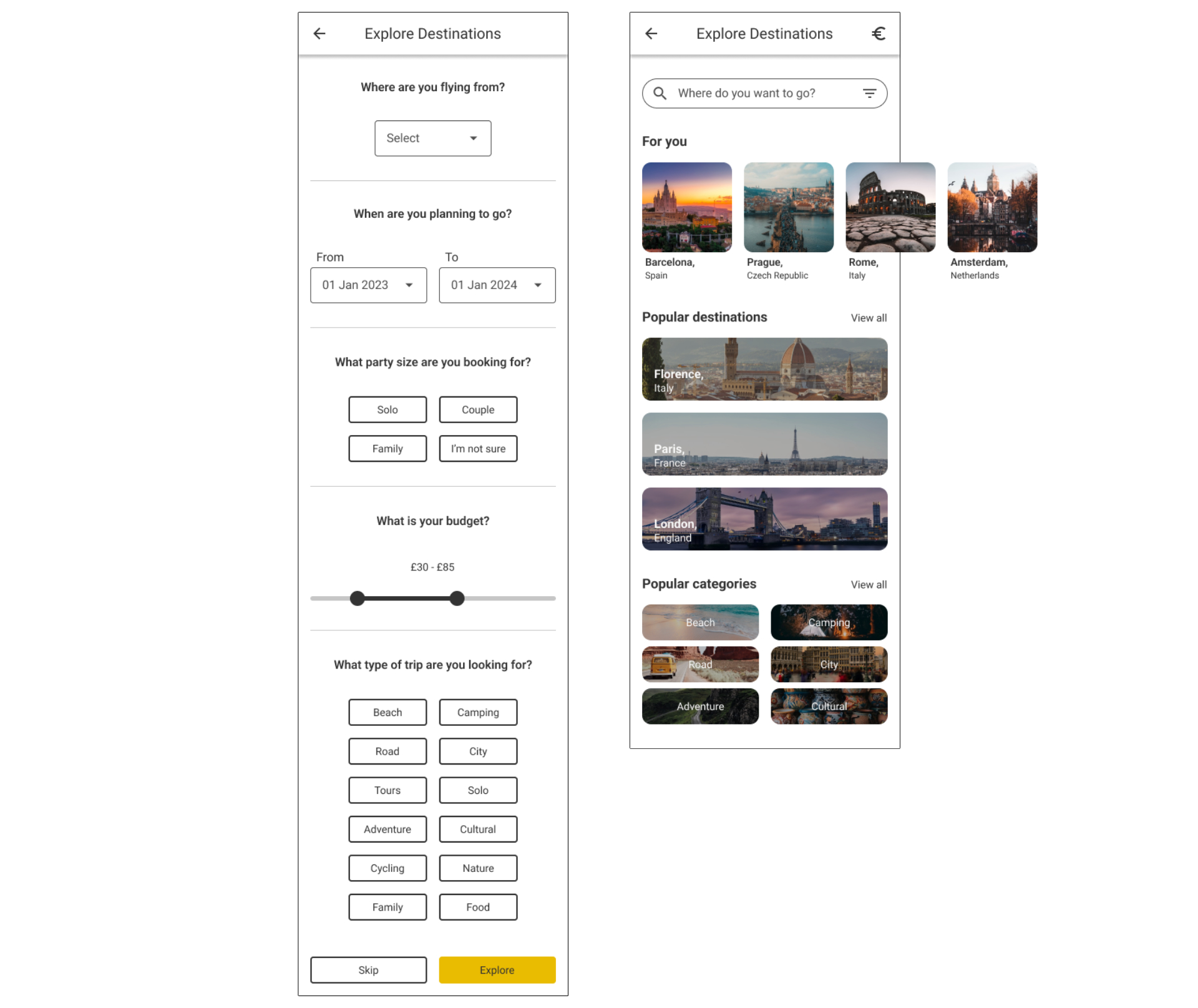
Phase 4 - Deliverables
Next steps and Reflection
Due to time constraints only three usability tests were conducted. This limited our ability to research for both higher numbers and more diverse demographics. As well as exploring user motivations, if given the time an in-depth competitor analysis would be conducted to understand what the market is doing and what gaps exist.
When presenting our findings and suggestions to the stakeholders, it was important to balance both user and business needs. Each stakeholder may have different priorities and interests, striking a good balance demonstrates that all relevant perspectives have been considered.
We were also not able to perform a round of usability tests on the delivered concepts. We would ideally go back into another round of usability tests with the prototypes to understand if any of the changes worked or not.