Calvin Ip
Daily UI 003: Landing Page
What's the main focus? Is it for a book, an album, a mobile app, a SaaS product? Consider important landing page elements (Headlines, call-to-action buttons, typography, clarity, etc.)
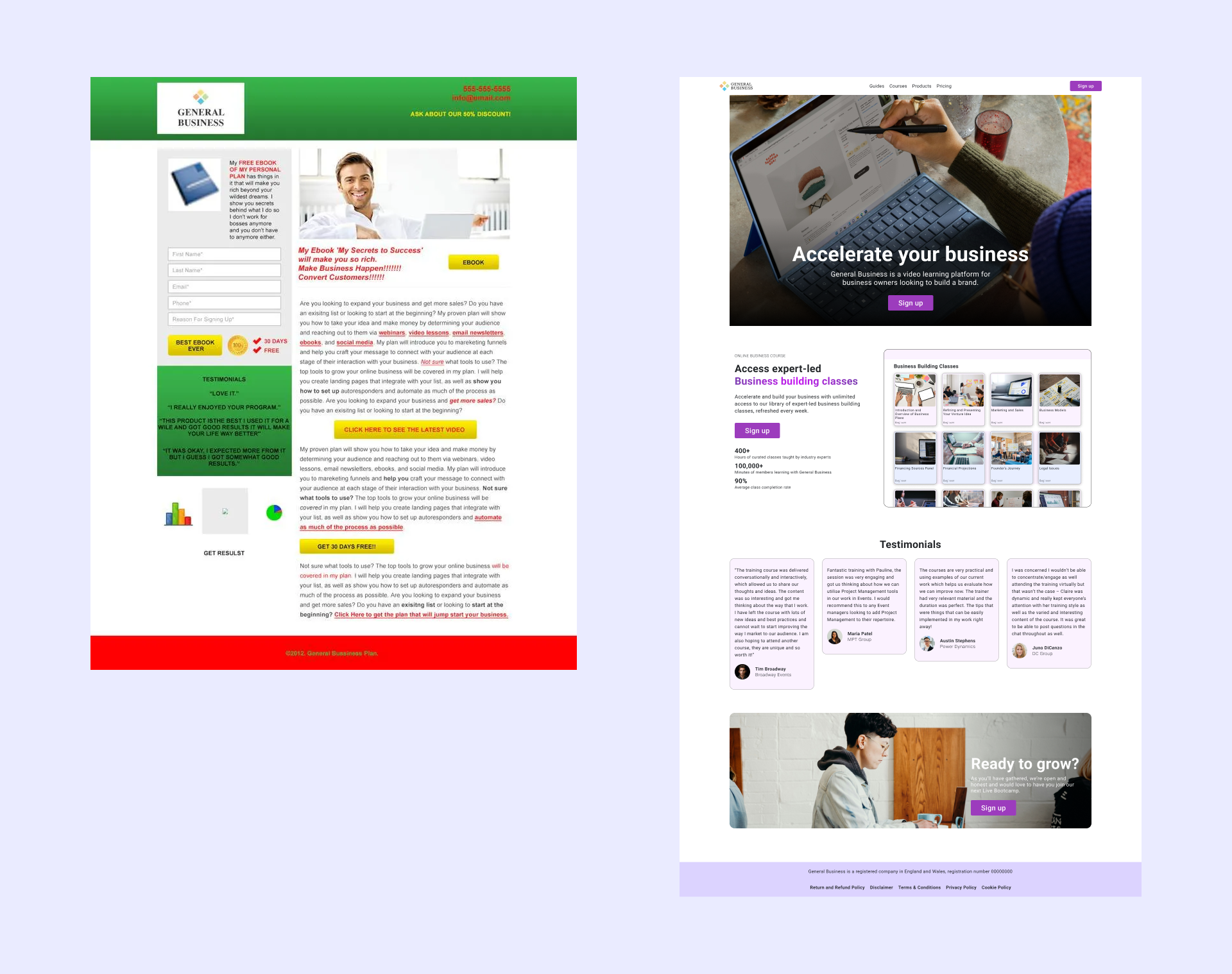
Design Changes:
- Changed the background colour of the header to a neutral colour, the green distracting away from the main content.
- Logo looks unprofessional with the white background, removed the background as well as reduced the size for improved hierarchy.
- Improved the visual hierarchy by introducing a hero image as well as reducing the amount of information/ clutter.
- Reduced the number of CTA's. Too many CTA's causes decision overload/ choice paralysis.
- Testimonials play an important role in user trust. Introducing a face, name and company to the testimonial also increases user trust.
- Buttons lack continuity. The uppercase text in the button also feels aggressive, making the user feel harshly pushed into making a decision.
- Poor contrast throughout the whole website, performed contrast checks on the website to improve text clarity and accessibility.