Calvin Ip
Daily UI 002: Credit Card Checkout
Design a credit card checkout form or page. Don't forget the important elements such as the numbers, dates, security numbers, etc.
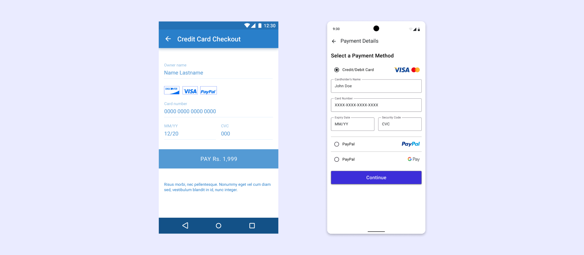
Design Changes:
- Remove the banner colour to improve flow.
- Reduce user frustration by making the payment method selection more accessible.
- Made the input fields more defined by introducing a clear border.
- Changed the colour of the button to improve contrast and accessibility.
- Reduce the width of the button to improve hierarchy.
- Reduce friction by introducing other payment options such as Google Pay.
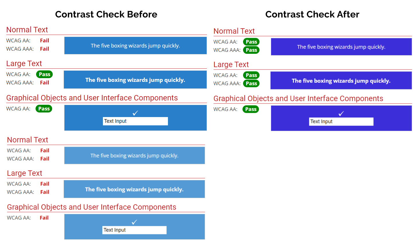
Contrast checks