Calvin Ip
Redesigning the Toreba Game App
Toreba, an online claw machine game by Cyberstep Inc., is currently the largest and most popular online claw machine game with over 20 million app installations. Users can play games and win prizes, which can then be sent to the user’s door.
The following case study is based on a personal project and I am not affiliated with Toreba.
- Role: Sole UX/UI Designer, UX Researcher, Visual Designer
- Industry: Gaming
- Project Length: 2 Week Design Sprint
- Platform: Android/iOS
- Tools: Figma, Miro, Jira
The Problem
Despite Toreba being the largest and most popular game in its category, the app is outdated and has not had a redesign in years. The number of in-game currency purchases has remained steady, however, they are looking for different ways to increase this with the redesign. Toreba want to understand:
- Why users are motivated in buying in-game currency.
- What keeps users returning to the app.
- Any pain points for users using the app.
- What changes can they make to encourage more users to buy in-game currency.
Solutions
- Conduct user interviews to discover the motivations behind users returning to the app and making in-game purchases.
- Conduct usability tests to uncover any pain points with the existing app.
- Deliver a redesign which encourages people to return to the app and make more in-game purchases.
Phase 1 - Research and Understanding Users
Interviewing Existing Users
I conducted a moderated remote interview with five existing users. The main goal of the interviews was to understand the reasons why users would buy in-game currency and what motivates them to frequently return to play.
Testing the Live App
After the interviews, I also asked the participants to test the live app. The goal of the testing was to understand how users interact with the different app features.
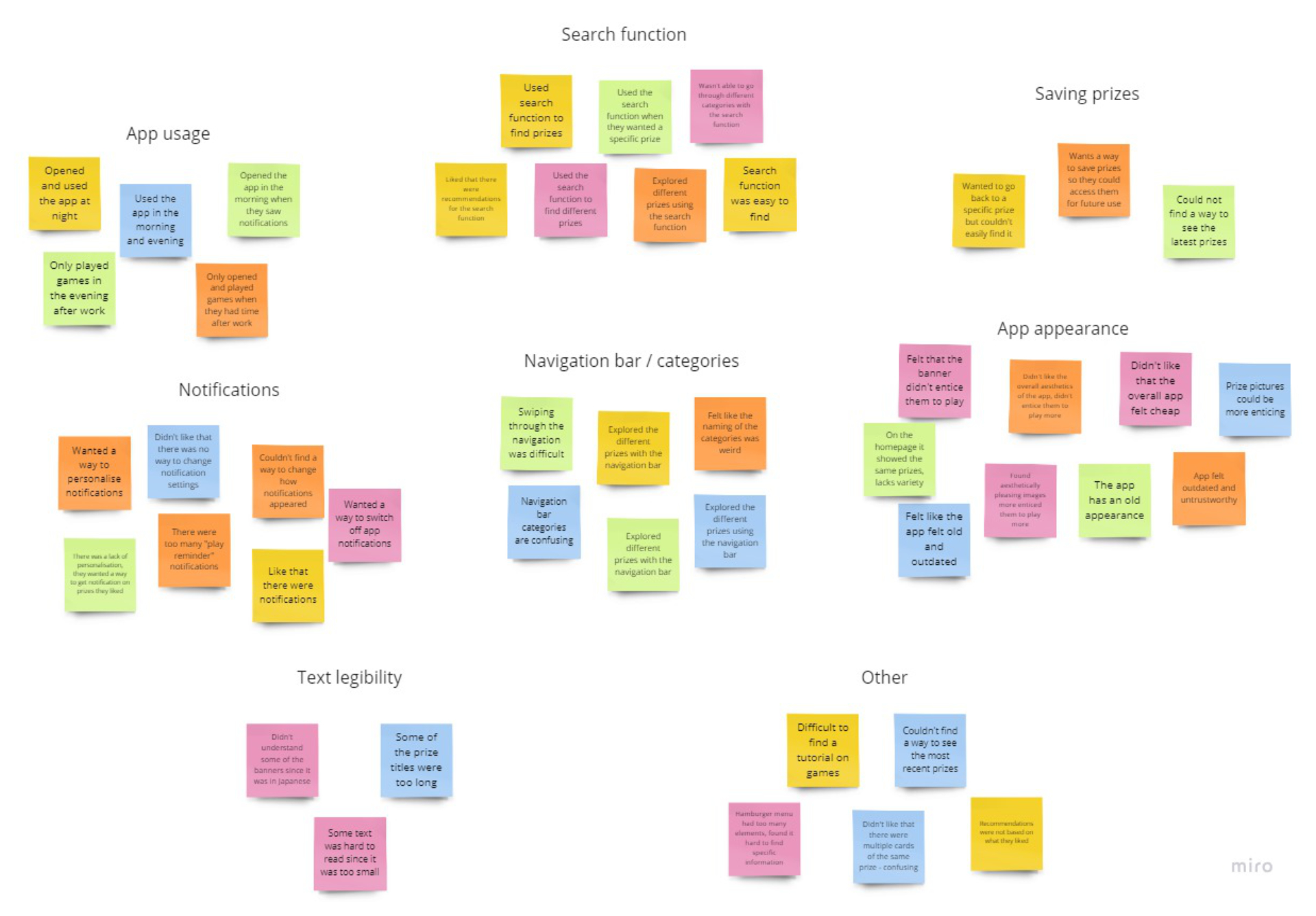
Insights from Interviews and Testing
- Notifications were useful in drawing the user back to the app, however, the notifications lacked personalisation and were “...annoying.”
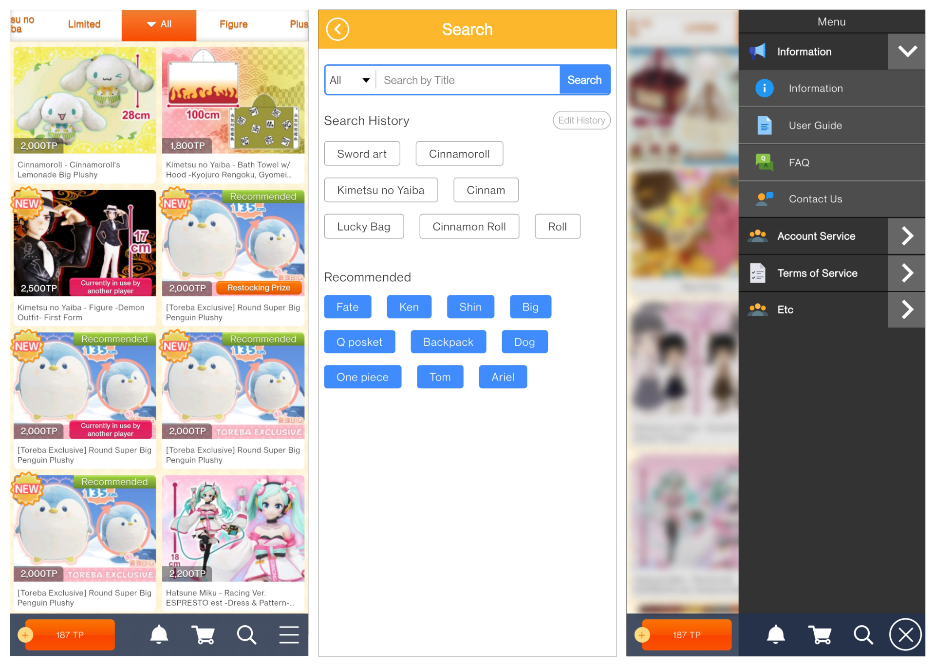
- Most users would explore the app with the search function.
- When returning to the app, it was difficult for the user to locate the same prize.
Phase 2 - Understanding and Defining the Problem
After examining the live app and synthesising the gathered research, the following pain points and user needs were defined.
Pain Points
Confusing and cluttered UI
Most of the users complained that the UI was so cluttered, making it hard to read and focus on what the prizes were. Although they were able to read what prizes were available, there were instances of the prize titles being too long and therefore not fully displayed.
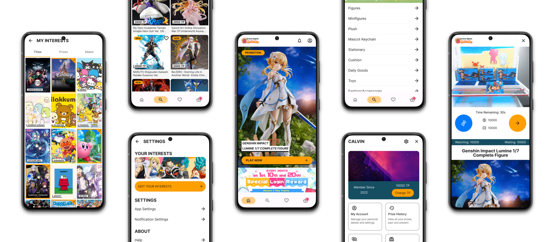
No game saving
Some of the users wanted to save a specific prize and game so that they could try and attempt to win the prize at a later date. Currently there is no save function available so the users had to remember the specific name of the prize and search for it manually.
Poor categorisation
Despite there being categories in the app, some users complained that some of the categories were a bit odd and better categories could be applied.
Notifications
Some users expressed that the notifications had irrelevant information to them, which they found tedious and annoying since they had to constantly clear these notifications.
User Needs
Personalisation
Users expressed that they want a more personalised experience, this includes setting up custom notifications for specific prizes and a way to save specific prizes for easy access.
More features
The users wanted more features such as saving games and sharing how they won their prizes via video.
Phase 3 - Prototyping and Sketching
Sketches
Rapid sketches were primarily used for both quick ideation and directional discussion. The sketches were placed in front of users to see what their feedback was.
Wireframes
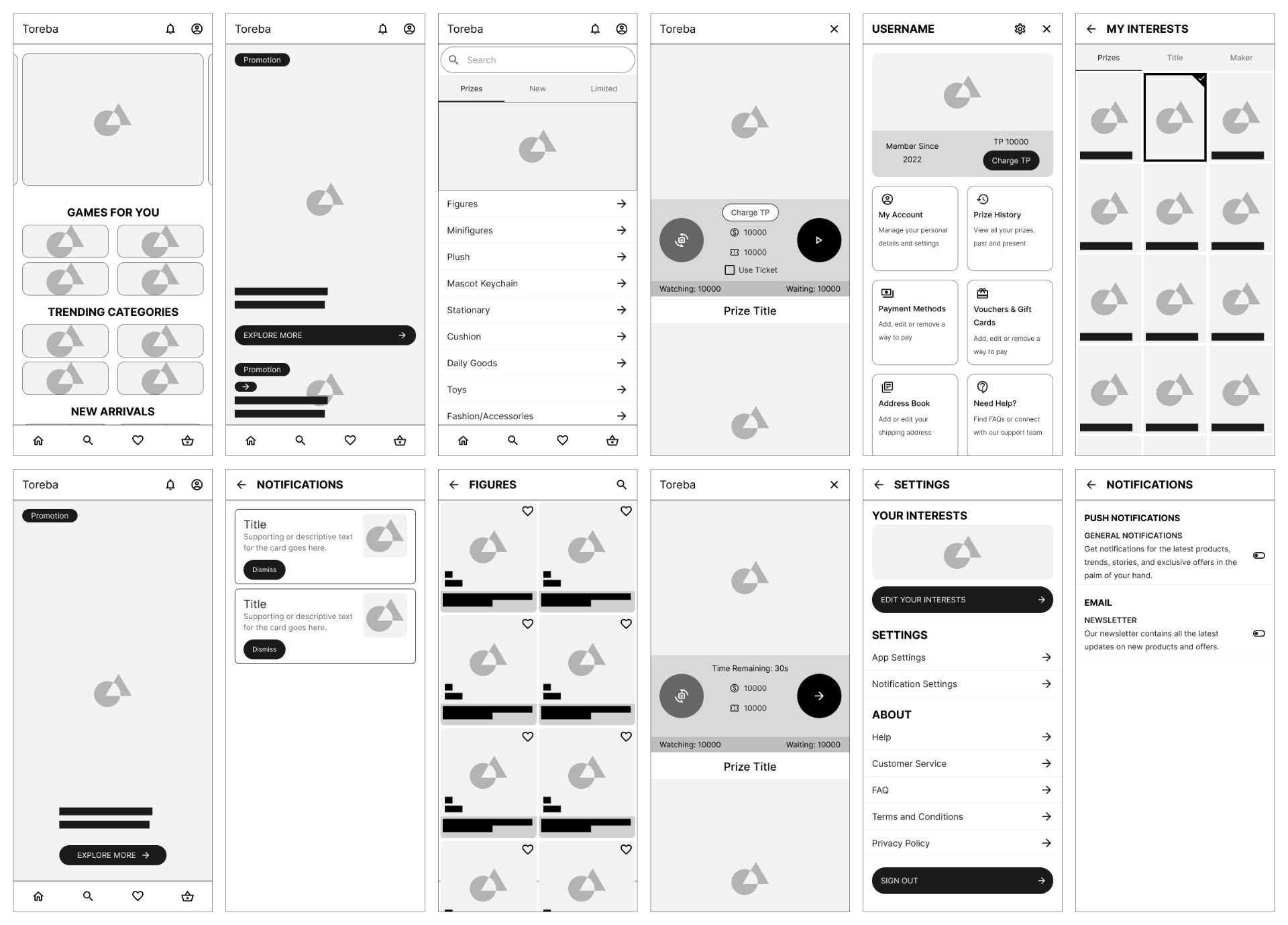
With tight time constraints, I focused on wireframing high impact pages whose functionality needed to be laid out.
These low fidelity wireframes were used to communicate content hierarchy and critical functionalities for development.
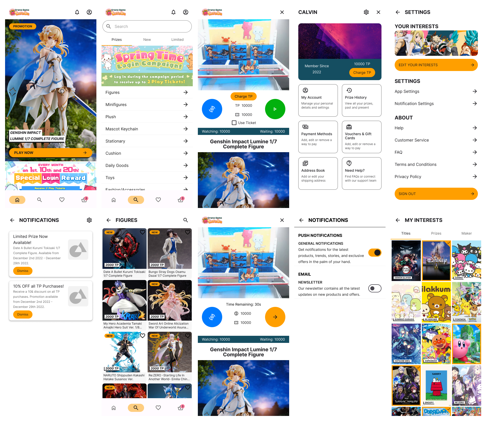
High-fidelity Mockups
Once I had a solid design direction, I began to produce low and high-fidelity mockups. These were then converted into prototypes with limited functionality.
Phase 4 - Deliverables
Reflection and Lessons Learnt
Naturally the next steps would be putting the redesign through another round of usability tests to see if the redesign solved the initial problem. Further iterations can then be done to refine and improve the redesign.
Looking back at the whole process, I enjoyed being able to take full ownership of the various roles of designing the app, naturally enjoying some roles more than others. Redesigning the app and working on the case study reminded me that while the users are the centre of the design process, it is important to balance the user needs with the business needs.