Calvin Ip
TattUS: an Image Sharing App with a Social Twist
Augustine is planning to launch an app, TattUS, that connects different types of visual artists in your area. She’s a visual artist and small business owner who wants to bring local artists together to exchange ideas about tattooing and other forms of visual art.
The following case study is based on a fictional scenario over a span of 10 weeks from a UX bootcamp.
- Role: Sole UX/UI Designer, UX Researcher, Visual Designer
- Industry: Image Sharing
- Project Length: 10 Weeks
- Platform: Android/iOS
- Tools: Figma, Miro, OptimalWorkshop
The Problem
As a freelance UX designer and consultant, my role was to research, prototype, test, design, and iterate on an image-sharing app with a social twist. With the market being so niche, we want to understand:
- What are the different methods which users use to find tattoo inspiration?
- What methods of tattoo idea generation users have.
- Do users collaborate with other people to generate tattoo ideas?
- Are there any pain points when searching for tattoo inspiration?
Solutions
- Conduct user interviews to discover the motivations on how users search and explore tattoo inspiration.
- Deliver an app which encourages users to collaborate with one another to generate tattoo ideas.
Phase 1 - Research and Understanding Users
Interviewing Existing Users
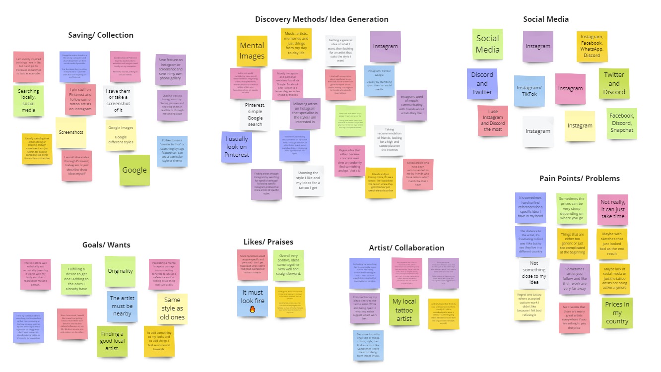
I conducted a moderated remote interview with five existing users. The main goal of the interviews was to understand the different methods people use to find tattoo inspiration. The other goal of the interviews was to see if users collaborated with other people to come up with tattoo design ideas.
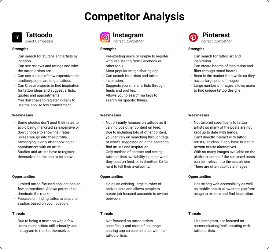
Competitor Analysis
Insights from Interviews and Competitor Analysis
- Most users used the social media platforms, Instagram or Pinterest to find and explore different tattoo designs for inspiration.
- Users tend to ask friends for opinions on their tattoo design/ concept.
- Users with existing tattoos all agreed that the tattoo artist knows what’s best in terms of the tattoo design and placement.
- It’s difficult to find references for specific tattoo ideas on Instagram and Pinterest.
- Tattoo sharing apps do exist, however, they still primarily use other platforms such as Instagram to market themselves due to the amount of reach.
Phase 2 - Understanding and Defining the Problem
After examining synthesising the gathered research, the following user needs were defined.
User Needs
Communication and Collaboration
Users expressed that they need a way to communicate and collaborate with friends because they want to draw inspiration from their tattoo ideas. As well as collaborating with friends, they expressed the importance of communicating their ideas or concepts with tattoo studios and artists.
Users also expressed that they need a way to visualise user collaboration because they want guidance in their creative process.
Exploring Ideas
The users need a way to quickly and simply browse a variety of different tattoo designs. Users new to tattoos want to broaden their understanding and knowledge of the different tattoo styles available.
Organisation
Users need a way to save and organise different tattoo designs so that they can share them with friends or different tattoo artists/ studios or for future reference.
Phase 3 - Prototyping and Sketching
Sketches
Rapid sketches were primarily used for both quick ideation and directional discussion. The sketches were placed in front of users to see what their feedback was.
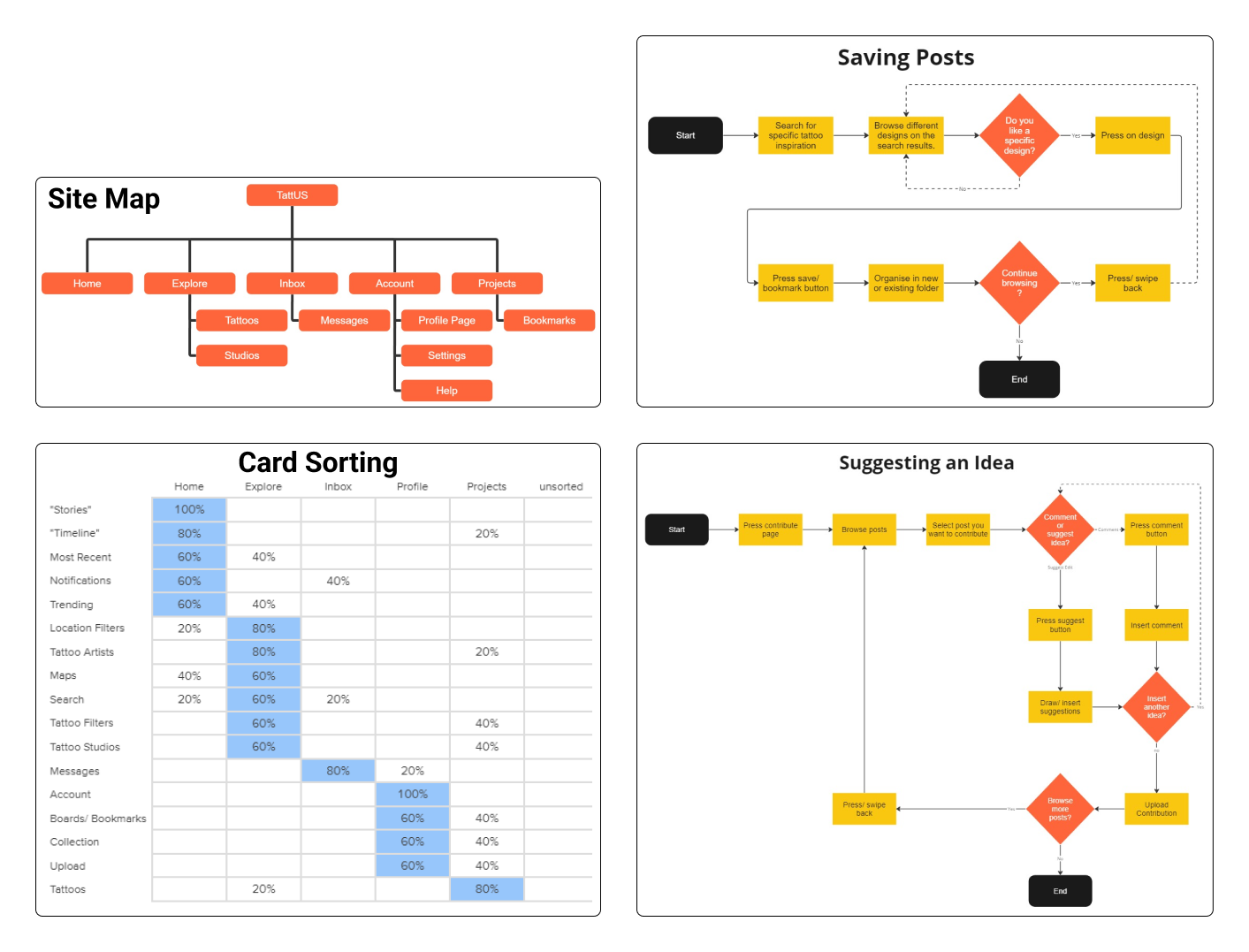
Wireframes
With tight time constraints, I focused on wireframing high impact pages whose functionality needed to be laid out. These low fidelity wireframes were used to communicate content hierarchy and critical functionalities for development.
The low-fidelity wireframes were then used to make a basic prototype of the app with limited functionality. This basic prototype was then used to conduct usability tests to validate design decisions, functions that needed improvement were then iterated on.
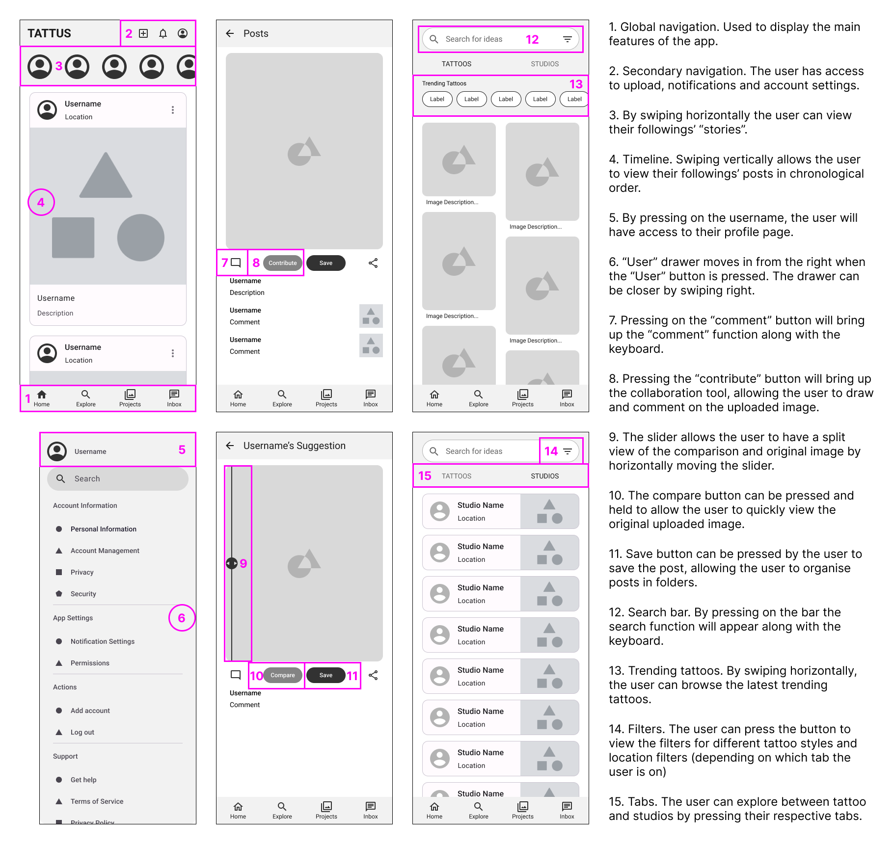
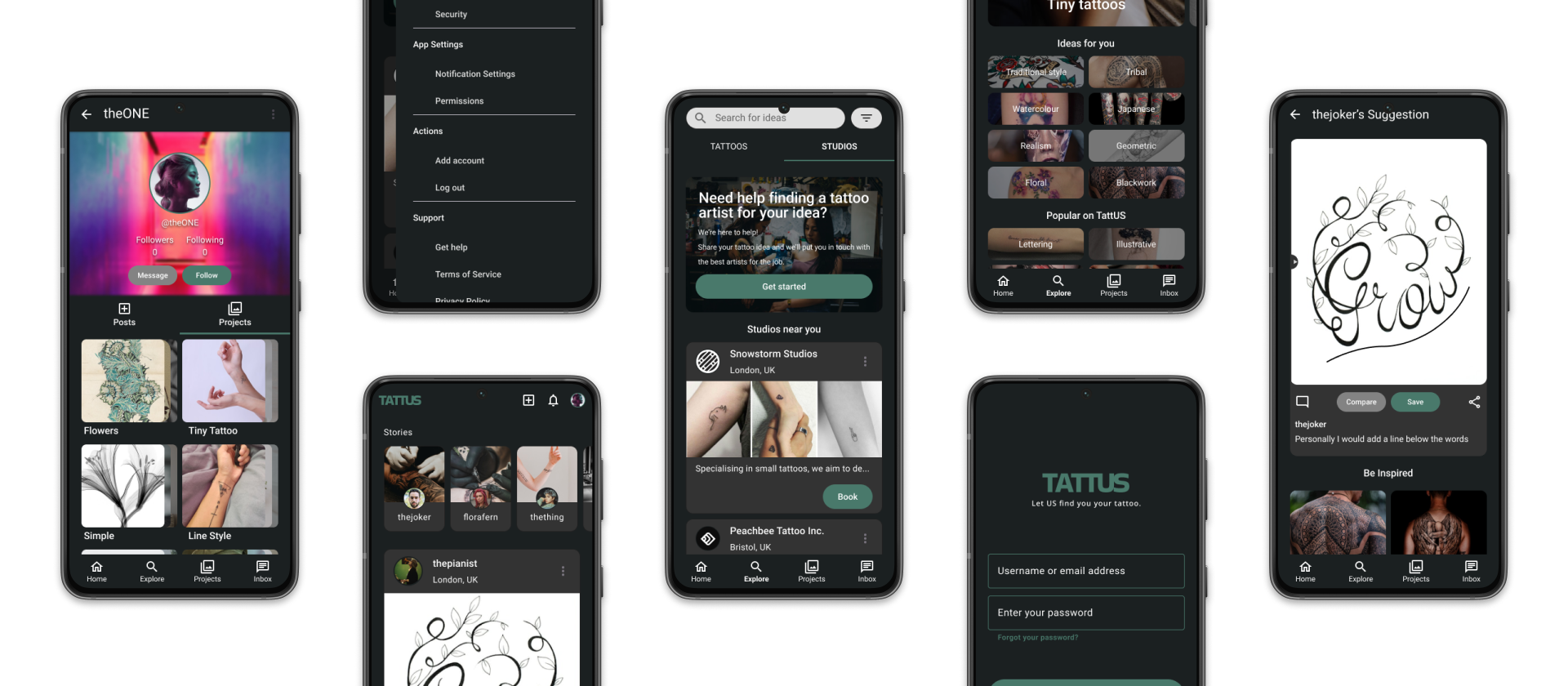
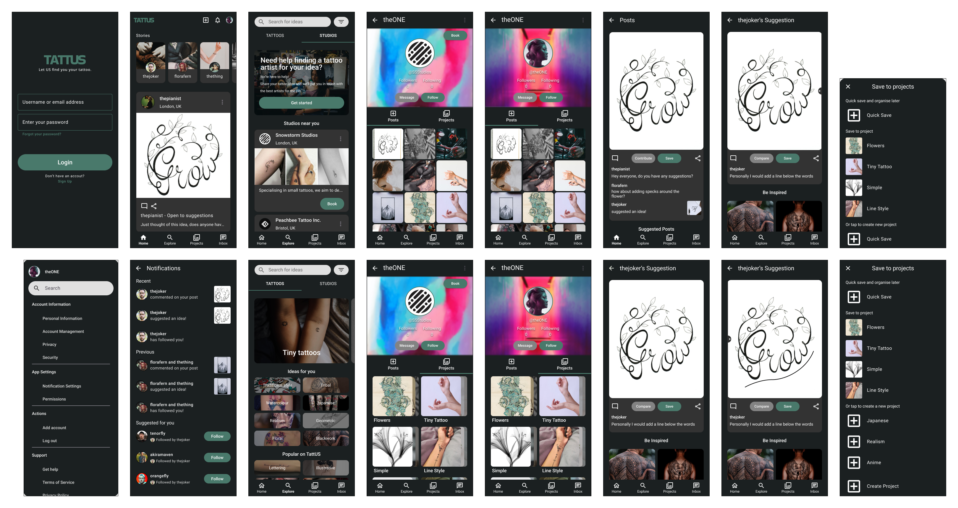
High-fidelity Mockups
Once I had a solid design direction, I began to produce low and high-fidelity mockups. These were then converted into prototypes with limited functionality.
Phase 4 - Deliverables
Reflection and Lessons Learnt
If given further time, I would have liked to further refine the design with some additional tests to validate some of my design decisions. Although out of the technical scope, some A/B testing would have been useful in validating certain design decisions.
I would have also liked to flesh out certain features such as a booking and messaging feature between clients and studios. Despite me designing with dark mode for accessibility reasons, it would have been nice to also design for light mode. Unfortunately I could not implement these features due to time constraints of the project.
Looking back at the whole process, I enjoyed being able to take full ownership of the various roles of designing the app, naturally enjoying some roles more than others. I enjoyed quickly and rapidly taking time to work on each stage leading up to the high-fidelity prototypes allowing me to practise and refine my design skills, as well as learning new research tools to add to my toolkit.