Calvin Ip
Inspiring Grocery Shoppers at China Centre UK
China Centre UK, a local Asian grocery store with both a physical and online presence. They want a way to convert more user visits into transactions.
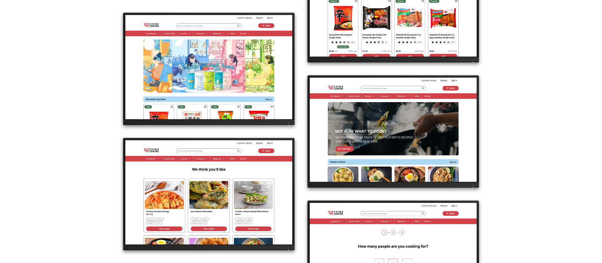
- Role: Sole UX/UI Designer, UX Researcher and Visual Designer
- Industry: E-Commerce
- Project Length: 2 Weeks
- Platform: Desktop Website
- Tools: Figma, Miro
The Problem
China Centre UK have recently launched their new website, but web statistics show that users are not making purchases on their website. They want to understand:
- What people think about their website.
- Why people are landing on the page but not making purchases.
- Any pain points for people using the website.
- What changes can be made to encourage more online purchases.
Solutions
- Conduct user interviews to discover the motivations behind user purchasing decisions.
- Conduct usability tests to uncover any pain points when using the website.
- Deliver a redesign which encourages and inspires people to make purchases.
Phase 1 - Research and Understanding Users
Interviews and Contextual Inquiry
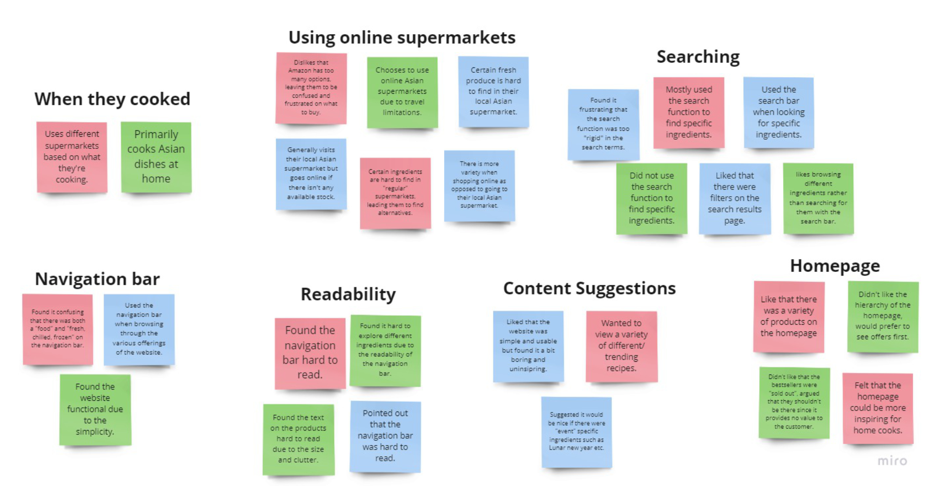
Three interviews were conducted on people who identified as home cooks with varying amounts of skill and experience. These interviews were used to collect information on user habits and motivations. In order to get a consistent user experience, the interviewees were given specific tasks to complete.
Interviews and Contextual Inquiry Insights
- Most users engaged in Asian cooking when they were inspired by a particular recipe.
- Specialised ingredients are hard to find in regular supermarkets, turning to online stores as an alternative.
- Users liked that there were a variety of products available to explore on the homepage.
- The search function was commonly used when looking for particular ingredients.
- Text on the navigation bar was hard to read and the product titles were cluttered.
Interviews and Contextual Inquiry
Now that we had some research and user data, I began looking at direct competitors. The goal was to scope out the online asian grocery store market, get inspired, and find opportunities for innovation.
I performed a light competitive analysis and used it to gauge which elements our competition was prioritising in comparison to the China Centre UK website. It turned out that the website had a lot of the core features our competition had. However, there was still a massive opportunity to be had in the design and development of those items and functionalities.
Phase 2 - Understanding and Defining the Problem
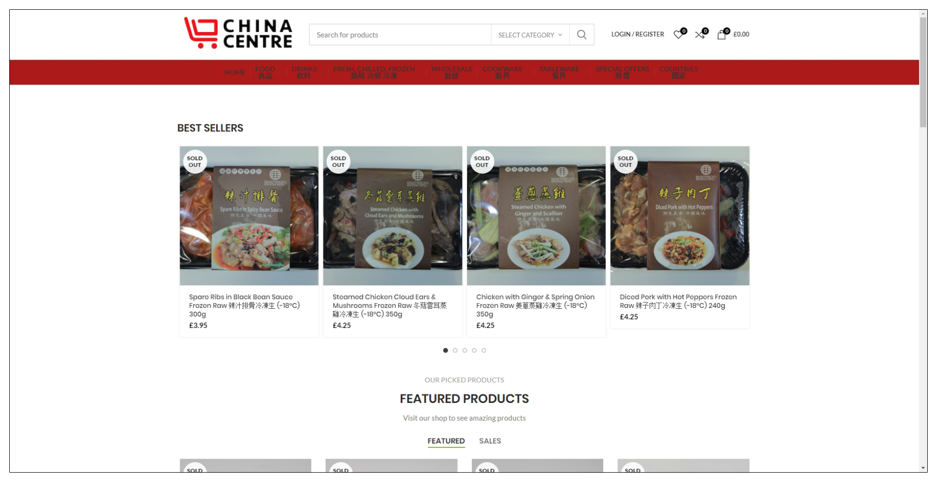
After examining the live website and synthesising the gathered research, the following pain points and user needs were defined.
Pain Points
Poor accessibility
Text on the navigation bar was difficult to read due to the poor colour contrast between the text and background. The product heading text was also too long, leaving users disinterested.
Poor information architecture
Despite there being categories on the website, some users complained that some of the categories were a bit odd and better categories could be applied.
No inspiration
There are currently no ways on the website to entice the users into exploring more products. Finding information on different ingredients and where to use them was not readily available.
User Needs
Personalisation
Users expressed that they want a more personalised experience, this includes finding recipes they like and viewing on-sale items.
Phase 3 - Prototyping and Iterating
Sketches
Rapid sketches were primarily used for both quick ideation and directional discussion. The sketches were placed in front of users to see what their feedback was.
Wireframes
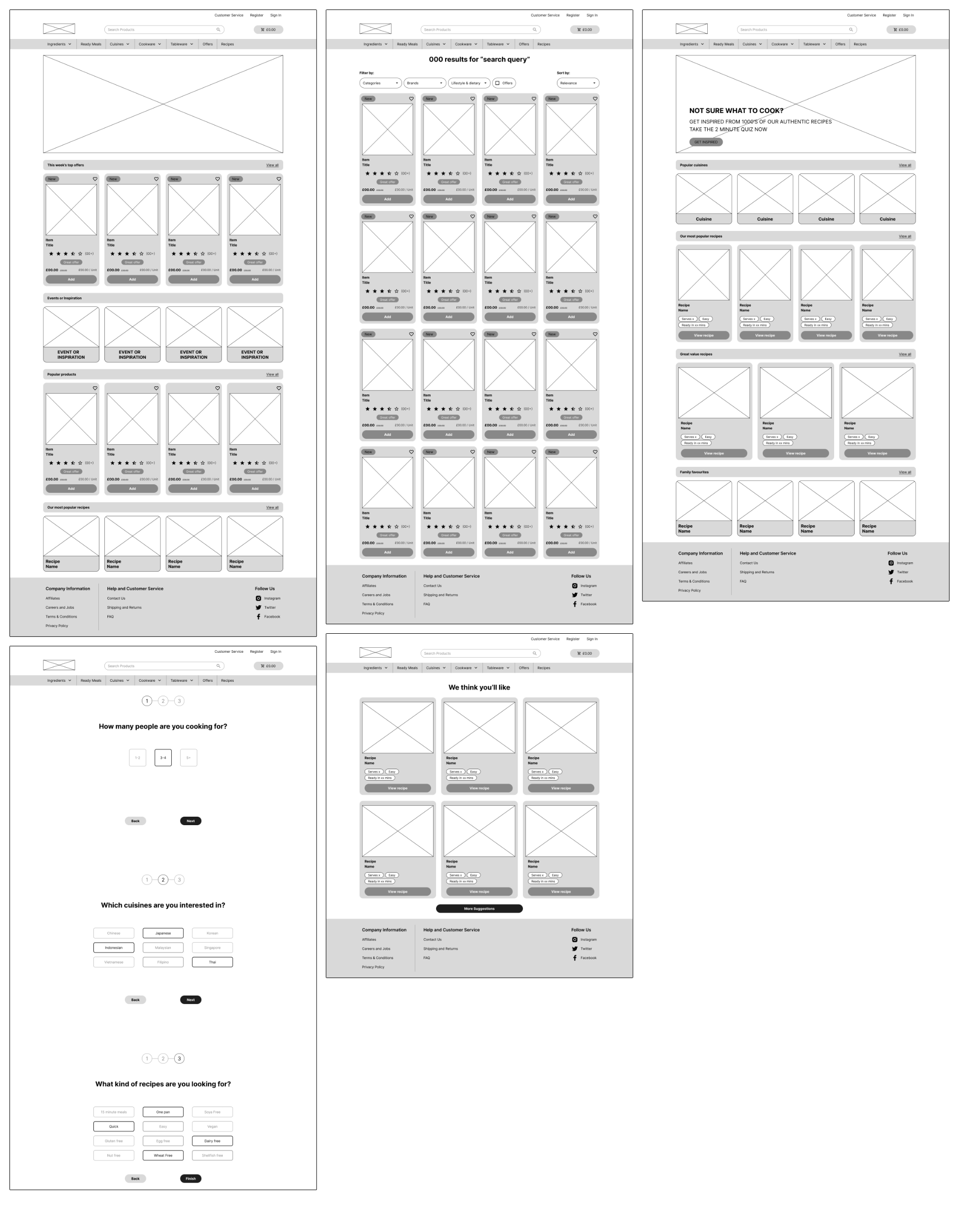
With tight time constraints, I focused on wireframing high impact pages whose functionality needed to be laid out.
These low fidelity wireframes were used to communicate content hierarchy and critical functionalities for development.
High-fidelity Mockups
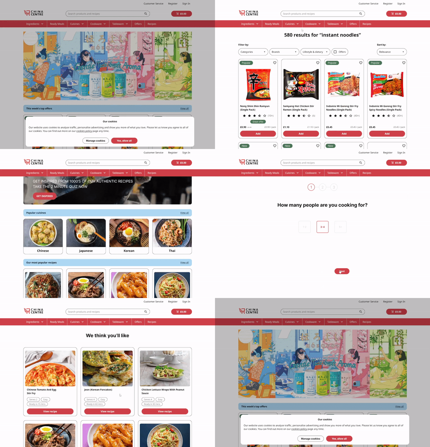
Once I had a solid design direction, I began to produce low and high-fidelity mockups. These were then converted into prototypes with limited functionality.
Phase 4 - Deliverables
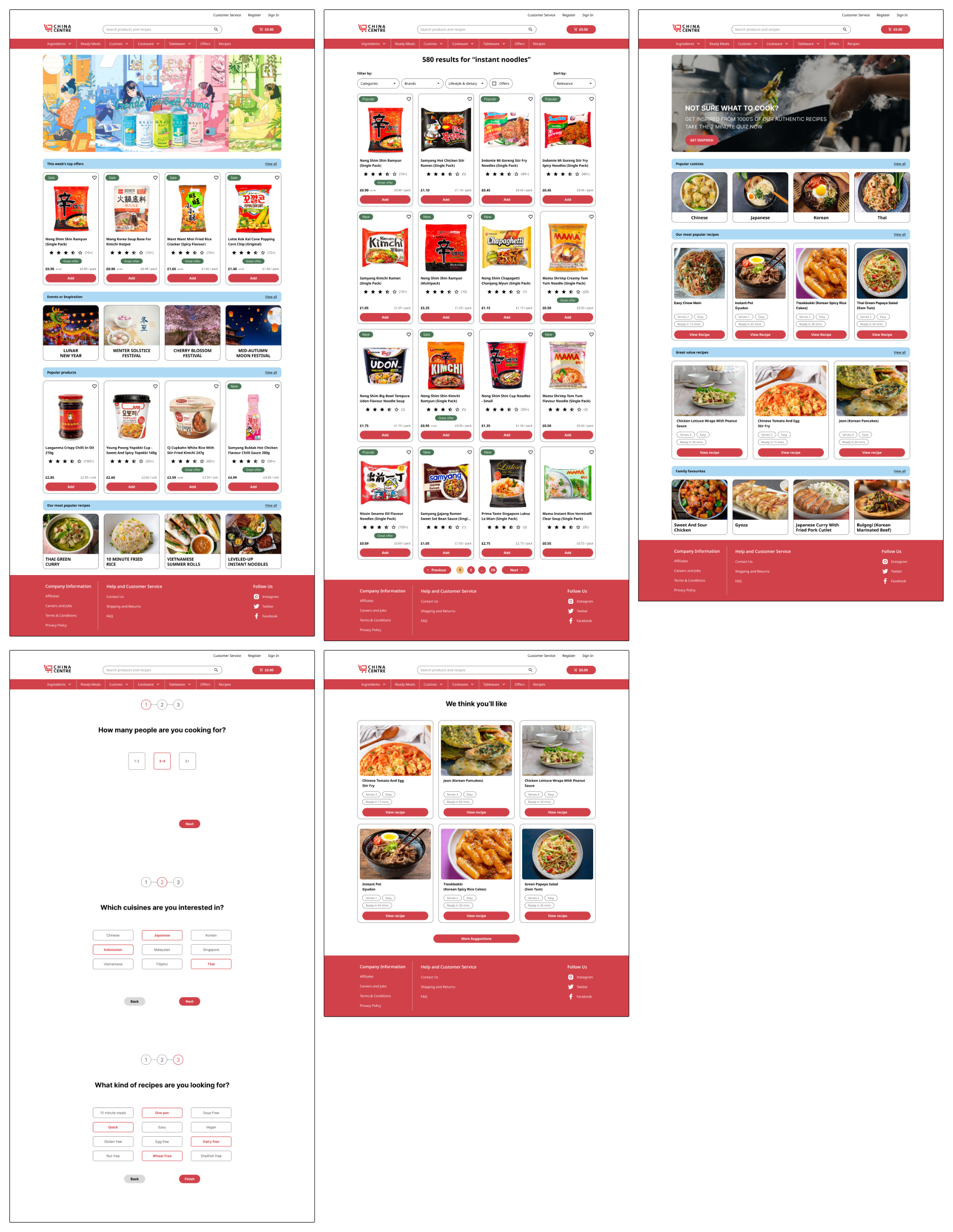
Reflection and Lessons Learnt
Due to time constraints, I was not able to do another round of usability tests on the prototypes to see if the redesign satisfies the pain points and user needs.
I believe that the new suggested recipe onboarding feature successfully inspires users into exploring more products. The feature also gives a level of personalisation which is not currently available on the live website.
Given the time, the prototypes would have been presented to the stakeholders to see if the redesign matches their business goals.